Everything TRUE looks like this.
Live examples, exact code, real production values. Every component below renders from the same source the Copy button gives you, so what you see is exactly what you ship. Built for the people and AI agents making TRUE products, from trueoriginal.com to TRUE Sign, TRUE Verify, TRUE Vault and TRUE Wallet.
Start here
If you are an AI agent or a developer building a TRUE product page, these ten rules produce a correct result. Read them, copy the design tokens, then take any component on this page verbatim with its Copy button.
- Copy the tokens first. Every example on this page assumes the token block and the real webfonts are loaded. Paste them before anything else and reference values only through
var(--true-*), never as raw hex. - Two typefaces, strict roles. Marcellus for display headings, Helvetica Neue Updated for everything else. Marcellus is never bold, never italic, and never used below 24px. Marcellus SC is reserved for brand hero moments and stat numbers.
- Body text is 16px over 24px in #636366. Headings and UI labels are #1C1C1E, never pure black. On dark sections secondary text is white at 0.80, never gray.
- The gradient is the signature, so ration it. One gradient moment per view: one word in the hero title, or the one closing band at the bottom, where the last call to action runs into the footer. Always 90deg, always blue into pink. Never on body text, never on borders, never as a page background.
- The primary button is ink, not pink. White text on #1C1C1E, radius 12px, padding 12px 24px. It always pairs with a ghost button. Pink is never a button fill.
- Radii by role. 16px for cards, panels and the navbar, 12px for buttons and FAQ items, 8px for inputs and glass, 999px for pills. Inputs are 8px, not 12px.
- Focus rings are blue, never pink. #0050BD on light surfaces, #7DCADE on dark. Production has no pink focus ring anywhere.
- Sections breathe at 160px. The vertical rhythm between major page sections is 160px. Light and dark sections alternate on purpose, so plan the sequence, do not stack two dark bands.
- The product header is a lockup. The TRUE gem plus wordmark, a single SVG asset in currentColor rendered 24px high, then the product ordbild after it. The default ordbild is plain text: body font at 11px, letter spacing 0.18em, uppercase, #636366, 10px from the wordmark. Only TRUE Sign has a designed ordbild. Section nav in the centre, a ghost plus a filled button on the right. See logo and wordmark and product page anatomy.
- Never invent a value. Everything here was read out of shipped TRUE code. If something you need is missing, check Provisional, and if it is not there either, ask before improvising.
Design tokens
The CSS custom property contract every TRUE product codes against. The values match the shipped trueoriginal.com stylesheet. The generated, importable token file is tokens/true-tokens.css, with the full rationale in SPEC.md. Import the file, or paste this block.
Production reality behind this contract: the live site defines exactly two custom properties, --gradient-blue and --gradient-pink, and hardcodes everything else per class. The contract above is the consolidation of those hardcoded values, verified against the shipped stylesheet. The contract corrects two production defects on purpose: the site falls back from Marcellus to Georgia, sans-serif (a serif chained to the wrong generic) and from the body face to Impact. Both corrections are recorded in DRIFT.md.
Logo and wordmark
The TRUE identity is one asset: the gem, a hexagonal shield built from three interlocking ribbons around a core, plus the TRUE letterforms, together in a single SVG. Every path in it takes currentColor, so the parent element sets the colour: ink on light surfaces, white on dark. The wordmark is not text and is never set in Marcellus or any other font. The gem also ships alone as the mark.
Brand architecture, the family
TRUE is the parent brand, and currently also the logo on trueoriginal.com. Under it sit five products: TRUE Sign, TRUE Verify, TRUE Vault, TRUE Wallet (formerly TRUE Profile) and TRUE Upskill. Every product lockup is the same two parts in the same order: the TRUE gem plus wordmark, then an ordbild after it. The gem plus wordmark never changes. Only the ordbild changes, and it comes in exactly two forms: the shared plain text default, or a product's own designed ordbild, which TRUE Sign and TRUE Verify have. TRUE Upskill is its own brand with its own shield and name, and carries no TRUE wordmark.
Centring the name on the wordmark
The plain text name is centred on the TRUE letters, in every browser and every font. Never centre it with align-items: center alone: that centres the text's line box, and where the capitals fall inside that box depends on the font file's own vertical metrics, which differ between fonts, operating systems and browser engines. A product that fell back to the system font on a Mac showed VAULT 2.4px above the TRUE letters. Pin the name to the wordmark instead. align-self: baseline on both puts the name's baseline on the wordmark's bottom edge in every engine, because an SVG's baseline is its bottom edge. position: relative with top: calc(0.36em - 0.5055 * var(--wm-h)) then lifts it into place: 0.5055 is one minus where the TRUE capitals centre inside the SVG (y 8.607 to 23.042 of the 32 unit viewBox), 0.36em is half the capital height of Helvetica Neue (0.714), and --wm-h is the rendered wordmark height, which the SVG reads too (its width is 3.125 times the height, the 100 by 32 viewBox), so the two cannot drift apart when a lockup is resized. line-height: 1 and margin-bottom: -1em keep the name from making the row taller than the wordmark. Measured in Chromium, WebKit and Firefox, the name then sits within a pixel of centre, which is the rounding every browser applies. This is for the plain text name only: Sign's script and Verify's ordbild are images whose ink is already centred, so they keep plain flex centring.
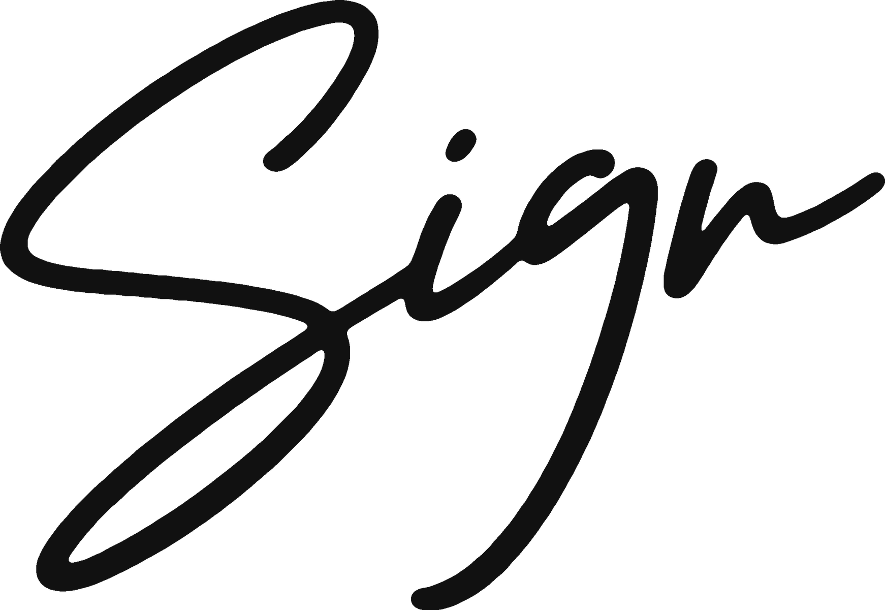
The plain text ordbild is shared and explicitly temporary: it is the default only until a product gets its own designed ordbild. TRUE Sign already has one, the handwritten signature below. When another product gets one, it replaces the plain text for that product alone, never for the others.
The exception, TRUE Sign's designed ordbild
TRUE Sign is so far the only product with a designed ordbild: the handwritten signature, shipped as a PNG sitting on the same optical baseline as the wordmark. It replaces the plain text for Sign alone. Treat it as the exception, not the norm: every other product keeps the shared default above until it has an approved ordbild of its own.
The script ships in this repo at assets/sign-script.png, an ink dark PNG on a transparent background, master size 1742 by 1200, downscaled by the browser for a crisp retina render. Copy the file into your project and keep the path relative, exactly like the fonts. Never redraw the script, the wordmark or the mark; copy the real assets.
Outside the system, True Upskill
True Upskill is deliberately not part of this architecture and not a sibling of Sign, Vault, Verify and Profile. The separation is concrete, not just declared: it lives on its own domain, trueupskill.com; its wordmark is True Upskill in mixed case, a deliberate decision, never normalised to caps; its typeface is Inter Tight, not Marcellus; and its mark is its own rounded tile, not the TRUE gem. No rule in this guide applies to it, so never build a TRUE lockup for it and never restyle its identity with these tokens. Its mark is not reproduced here on purpose: this repo does not carry the asset, and approximating a logo is never acceptable. It has its own guideline: the True Upskill Brand Guideline.
Rules
Clear space: keep at least 12px on all four sides at navbar size, which is the one clear space value expressed in code, and scale it with the mark at roughly 0.375 times its height. The full wordmark also ships as ready made SVGs, 100 by 32 in the navbar and 110 by 32 in the footer. Write the name as TRUE Sign, TRUE in caps with a space, never TrueSign. The smallest shipped render of the mark is 16px, in the product mockup's compact header; treat that as the floor.
Colour
TRUE is an ink and white brand with two accents. In the shipped stylesheet, white and ink dominate by an order of magnitude; blue and pink appear 13 times each. That ratio is the point: accents stay rare so they stay loud. Click any swatch to copy its value.
Core palette
Functional colours
Smaller roles, still read straight out of production.
White on dark, the opacity ramp
On ink sections nothing is ever gray. Depth comes from white at six fixed opacities. The one people get wrong: secondary text on dark is white at 0.80, and 0.56 belongs to placeholders only.
Roles
| Role | Light section | Dark section |
|---|---|---|
| Headings | #1C1C1E | #FFFFFF |
| Body text | #636366 | rgba(255,255,255,0.8) |
| Borders | #E5E5EA | rgba(255,255,255,0.4) |
| Raised surface | #F8F8FB | rgba(255,255,255,0.16) |
| Muted button border | rgba(28,28,30,0.4) | rgba(255,255,255,0.48) |
| Focus ring | #0050BD | #7DCADE |
| Placeholders | #636366 | rgba(255,255,255,0.56) |
Body copy sits in gray. Emphasis steps up to ink, not to bold black.
Pure black paragraphs with pink accents inside running text.
Gradient
The blue into pink sweep is the single most recognisable TRUE asset. It is always 90 degrees, always #7DCADE into #D82A80, and it appears once per view: one word in a title, or the one closing band at the bottom of a page, where the last call to action runs into the footer. Ration it and it stays a signature. Spend it everywhere and it becomes wallpaper.
Gradient text, one word only
The strongest use of the gradient is a single word inside a serif title. Clip it to the text, keep the rest of the line in ink or white.
The closing band: the last CTA runs into the footer
The one place the gradient covers a surface, and it happens once, at the bottom. The last call to action is itself a full bleed gradient section, with no bottom padding, and it runs straight into the footer's gradient band, where the dark footer card sits. The eye reads one band from the heading down to the footer. Straight from TRUE Sign's .contact-grad and TRUE Verify's issuer call to action. On it, in order: a heading in white Marcellus at 30px or larger, at most one supporting sentence under it in white at 17px, then the button. The sentence belongs to the heading, so it sits with it on the band; a sentence left above the band in ink reads as a stray paragraph. Keep it to one sentence and no wider than 580px, since white body text is at its faintest on the blue end.
The miniature cuts the footer card off after its first line; the full card is under Footer. The heading steps down to 34 on 42 below 980px and to 30 on 38 below 620px. Where a page has no call to action of its own, the footer band is the closing band on its own, as on TRUE Vault.
Thin gradient strip
A 4px to 6px strip along the very top of a page quietly brands a product surface without spending the hero moment.
The sanctioned variations
Five ways the one gradient may appear, each traced to real code. Nothing else.
| Variation | Recipe | Job |
|---|---|---|
| Gradient text | background-clip: text with a solid pink fallback colour first | One word in a hero title. |
| Top strip | The gradient at height: 6px, full bleed | Branding the top edge of a product page. |
| Closing band | The gradient full bleed, shared by the last CTA and the footer, one band | Ending a page. See the closing band above. |
| Gradient border | A 2px padded gradient parent with an ink filled child at the same radius | Outlining a pill or button without filling it. |
| Gradient rule | height: 2px; width: 64px; border-radius: 2px | A short accent rule under an eyebrow. |
Lookalikes that are not the brand gradient and must not be used as it: the one off vertical fade linear-gradient(180deg, #7DCADE, #fff), the photo scrims, and the ticker mask. Never add a third stop, a midpoint, an opacity ramp or a new angle.
One moment per view.
Every single headline glows.
Numbers sit on ink, never on the gradient
Step numbers, ordinal badges and icon tiles with a numeral or letter are solid var(--true-dark) with the numeral in white. The gradient is never the background behind a number.
Typography
Two families carry the whole brand. Marcellus, a Roman inscription serif, gives headings their gravity. Helvetica Neue Updated does everything else. The pairing is the brand voice: established yet modern. Every size below is read from the shipped stylesheet, not rounded.
The scale
Nine steps cover every real use. The specimen below is the copyable heading kit: paste the CSS once and use the classes everywhere.
Links in running text
A link inside a sentence is marked by its underline, not by a colour. It sits in body gray, and only on hover does it darken to ink. Decided by Patrik on 15 September 2026 after five variants were rendered on a real page: "Rosa länkar skriker för mycket."
| Question | Answer |
|---|---|
| Why not the brand blue | It is a light accent, not a text colour. #7dcade on white measures 1.85:1 against the 4.5:1 floor for body text, so it is unreadable in a sentence. It belongs on dark surfaces, where it reaches 9.2:1. |
| Why not the brand pink | It reads at 4.6:1 on white, so it is legible, but a page of pink links shouts. Pink stays the accent for emphasis, buttons, rules and gradients. |
Why a:not([class]) | Every designed link already carries a class: buttons, navigation, footer links, card wrappers. The selector reaches exactly the links that were never styled, and leaves every deliberate design alone. It is one declaration in the shared head, never a per page rule. |
| Dark surfaces | Gray on a dark band drops to 2.85:1. Inside a dark section the link inherits the colour of the text around it and keeps only the underline. |
| What this replaced | Until 15 September 2026, 170 of the 180 pages on trueoriginal.com rendered running text links in the browser default rgb(0, 0, 238), because the old export never set a link colour at all. |
Weights and facts
| Fact | Detail |
|---|---|
| Weights | 400 carries the brand (118 production rules). 500 is emphasis and UI labels (48). Only 400 and 500 exist in the canonical body family, so never write 700 against it: the browser synthesises a fake bold. Where a design says bold, use 500. The legacy Helveticaneue family (with Light and Bold) is being migrated away; do not copy it. |
| Marcellus fallback | Production writes Georgia, sans-serif, which is a defect: Georgia is a serif, so the generic should be serif too. The contract corrects it to Georgia, serif, recorded in DRIFT.md. Always reference the family through var(--font-display). |
| Viewport hero | One production hero variant sets 6vh/6vh instead of 72px so the title tracks viewport height. Use only for full bleed photographic heroes. |
| 24px ambiguity | At 24/32 production splits: editorial titles use Marcellus, UI card titles use Helvetica Neue Updated 500. Both are correct; pick by context, serif for content, sans for interface. |
| Lato | The site loads Lato on every page but uses it in exactly one rule. Legacy. Do not use Lato in new work. |
| Ghost family | 16 production rules name "Helveticaneue Roman", a family with no font file behind it. It silently renders the fallback. Never reference it. |
| Reset trap | Unclassed h1, h2, h3 inherit the Webflow reset: bold Arial at 38, 32 and 24px. Always style headings explicitly. |
Titles and text
How TRUE writes, not just how it looks. Titles are sentence case, short and declarative, and they promise a benefit or state a fact. A title may end with a full stop when it is a statement. Never Title Case, never exclamation marks.
The title block
The standard opening of any section: kicker, title, preamble. Copy it as one unit.
Kicker as a pill
In heroes the kicker may wear a pill: same text style, wrapped in a white surface with a hairline border and full radius.
Paragraphs and links
Running copy is 16px over 24px in gray, at most 640px wide. Blog and long form articles drop to 14px over 24px in ink. Emphasis steps to weight 500 in ink. Inline links are pink and underlined on light, brand blue and underlined on dark; standalone links with a trailing arrow use ink with a bottom border that turns pink on hover. Never brand blue for a link on white, it is unreadable.
Lists
Feature lists use a leading tick in brand blue. Plain lists keep standard bullets in gray. Both stay at body size.
Voice
| Rule | Yes | No |
|---|---|---|
| Sentence case | Grow your community with verifiable credentials | Grow Your Community With Verifiable Credentials |
| Benefit or fact first | Create, send and store certificates online | Welcome to our certificate platform! |
| Full stop on statements | Everything a signature needs. Nothing it does not. | Everything a signature needs… |
| Concrete numbers | 200+ issuers, 900 000 recipients | Trusted by many organisations |
Spacing and layout
TRUE spacing is generous and deliberate rather than mathematical. There is no strict 8 point grid in production; there is a small set of recurring distances, and one number that defines the brand rhythm: 160px between major sections.
The rhythm
Major sections sit 160px apart, sixteen times over on the live site, expressed as a top margin. New product sections use symmetric 84px padding instead, as the approved mockup does, because margins collapse against neighbours and padding does not. Inside a section, related blocks sit 48px to 80px apart; inside a component, 8px to 32px. If you take two numbers from this guide, take 48px for every panel's padding and 160px for the space between sections.
Containers
Production never settled on one container; these are the widths that actually ship. For a product page use the 1180px container. One warning: 1360px is not a container, it appears once on a single panel, even though the old guide and one product adopted it as the page width.
| Container | Width | Use |
|---|---|---|
| Product page | 1180px + 28px padding | Use this. The canonical product container for TRUE Sign, Vault and Verify. |
| Regular | 1260px | The standard marketing content container. |
| Navbar | 1000px | The floating navigation bar, always. |
| Wide grid | 1440px + 4em side padding | Twelve column feature grids. |
| Resources | 1160px + 28px padding | The /resources/ system, about 70 live pages. |
| Legacy | 940px | Old Webflow default. Do not use in new work. |
Recurring distances
| Distance | Job |
|---|---|
8px | Navbar internal padding, tight icon gaps. |
12px / 16px | Button and input padding, small gaps. |
24px / 32px | Component internal padding, FAQ items at 32px. |
48px | Card padding, CTA padding, footer padding. The signature TRUE padding. |
80px | Feature section vertical padding. |
120px | Footer top margin. |
160px | Space between major sections. The rhythm. |
200px 88px 40px | Hero padding: top, sides, bottom. |
Breakpoints
Three breakpoints, straight from the Webflow build: 991px, 767px and 479px. Grids collapse to one column below 991, heroes drop their stage below 767, type steps down one size below 479.
Radius
Corners are role coded. Production uses 16px ninety nine times, 8px sixty two, 12px thirteen. Everything else is a specific job. If an element does not match a role below, it takes the radius of its container's role.
| Radius | Role |
|---|---|
8px | Text inputs, glass badges and panels, small embedded cards. |
12px | Every standard button, FAQ items, floating chips. |
16px | Cards, panels, the navbar, the footer, CTA bands. The default surface radius. |
999px | Pills: kicker pills, filter chips, load more buttons. |
80px | The 64px circular icon button only. |
7px | The green yes badge only. |
50% | Dots and avatar circles. |
4px | Tiny embedded elements: field markers, code chips. |
Shadows and glass
TRUE is a flat brand. Depth comes from borders, surface tints and the light and dark alternation, not from drop shadows. Production ships exactly five box shadows, each with one job. If an element is not one of these five things, it has no shadow.
Glass
Two glass recipes exist, both for content floating over imagery or dark surfaces. The badge blurs a little and lets more white through; the panel blurs hard and stays darker. Both sit on radius 8px.
Backdrop blur steps
Blur strengths in production: 8px for the fixed navbar over content, 16px for glass badges, 20px and 40px for decorative overlays, 80px for glass panels. No other values.
Motion
Interface motion is nearly invisible: four durations, plain ease, applied to named properties only. Ambient motion, the slow floating and drawing in hero stages, belongs to the hero and nowhere else: nothing in the body of a page loops, and nothing animates on scroll. Everything respects reduced motion preferences.
The standard hover
Hover feedback runs at 150ms with plain ease: a filled button drops to opacity 0.85, a ghost darkens its border, a link turns pink. Nothing scales, nothing glows, and a button picks one effect, never two.
Spinner
The one production keyframe: a 0.8s linear spin.
Ambient float
Floating proof chips in hero stages drift 9px up and back over 5.5 seconds. Stagger siblings with animation delays so they never move in unison. From the approved product mockup.
Slammen, the seal stamp loop
The TRUE Sign landing hero animation: a three second loop in which a signature draws itself onto a document, then TRUE's mark slams into the bottom right corner with an impact squash and a 2px document shake, holds, fades and restarts. It runs on transform and opacity only, so every frame stays on the compositor. The stamp is the official hexagon path copied verbatim from the mark, never redrawn. The scene lives in a fixed 320 by 360 box reserved up front, so the loop never contributes layout shift on the page that hosts it.
| Phase | Window | Movement |
|---|---|---|
| Fade in | 0 to 4% | The scene fades from 0 to 1 on the linear cycle; the document sheet is up by 4%. |
| Draw | 8 to 38% | The signature draws itself along its path, stroke-dashoffset 1 to 0 with pathLength="1", ease-in-out. Finishing at 38% leaves a beat before the slam. |
| Slam | 40 to 46% | The mark drops from 34px above at scale 2.6 and lands at a 1.08 overshoot squash, on the stamp fall curve cubic-bezier(.5, 0, .7, .2). |
| Shake | 40 to 43% | The document micro shakes 2px down and back on impact, ease-out. |
| Settle | 46 to 49% | The mark settles from the 1.08 squash to scale 1 and holds. |
| Fade out | 92 to 100% | The whole scene fades out and the loop restarts; the quick fade in hides the seam. |
Reduced motion freezes the same DOM on its final assembled frame: document up, signature drawn, mark stamped, nothing moving. The generic reduced motion guard is not enough here, because the stamp's resting style is invisible; collapsing the animation to a single instant frame leaves the scene blank. Any loop whose base state is empty must also pin its final frame explicitly, the way the media query in the example does. The pattern is reusable for every drawn or stamped scene: reserve the box, keep one DOM, and let the preference choose between the loop and the finished frame.
| Token | Value | Job |
|---|---|---|
| instant | 0.1s ease | Nav link colour changes. |
| fast | 0.15s ease | Hover feedback: button opacity, ghost borders, link colour, card lifts. |
| base | 0.2s ease | State changes. |
| slow | 0.3s ease | Larger surface changes. |
| spin | 0.8s linear infinite | Loading spinners. |
| float | 5.5s ease-in-out infinite | Ambient hero chips, 9px travel. |
| slam | 3s cubic-bezier(.5, 0, .7, .2) infinite | The Slammen seal loop stamp fall, the one custom curve in the brand. |
| pulse | 2.4s ease infinite | Attention breathing on drop zones, opacity 0.75 to 1. |
Forms and inputs
Two input surfaces ship today. The website field is a quiet well: surface tint with a border in the same colour, so at rest it reads as a soft recess and on focus the ring does all the talking. The product field, shipped identically by Sign and Vault, is white with a hairline border and a soft blue halo on focus. Radius is 8px for every input in production, one step tighter than buttons. Focus is always blue, never pink.
Anatomy
Label above, field, help text below. The label points at the field with for and id, help text is wired in with aria-describedby, and required fields carry the required attribute with a pink asterisk the screen reader skips. No product marks required fields yet; the asterisk is the proposal, tracked in Provisional.
The product field and its states
Sign and Vault ship the same outlined field: white fill, hairline border, 15px type, padding near 10px 13px. Its shipped focus is a blue border with a 3px halo in the product tint #EEF8FB, the one focus treatment in production that is not an outline, and it is still blue. Read only fields switch the fill to the tint; that is Sign's copy friendly signing link row. No product styles a disabled input, so the grey here is derived from Sign's disabled primary button and is provisional. Tab into the example to see the real ring.
Sizes
Production uses two. The website field is 16px type with 12px 16px padding; the product field is 15px with 10px 13px. Vault's variant adds a 44px minimum height for touch, and Sign's sidebar squeezes a third, 13px micro size that ships without any focus ring; do not copy that one, it is recorded as a mistake in the do and do not pairs below.
Icon and unit adornments
No product ships an input icon, a unit suffix or a search field yet, so these three are compositions of existing tokens and sit in Provisional. The icon is 16px in the body gray inside the field's padding; the unit is body gray text the field is described by.
Textarea
The textarea is the field grown taller. One rule comes from the single textarea in production, in Vault's admin: it resizes vertically only. resize: vertical with a minimum height keeps the column intact while the user pulls.
Validation
Success is the one semantic colour the brand owns: a green #1CA800 tick beside a message in body ink. Error has no brand colour yet; Sign raises errors in pink, Vault and Verify in two different reds, and none of the three is a brand decision, so the guide will not pick a side. Until the central decision lands, tracked in Provisional, an invalid field turns its border ink, sets aria-invalid, and says what went wrong in words through aria-describedby and role="alert". The state is carried by the border, the message and the attribute, never by hue alone.
Select
All three shipped selects are native, and none of them customises the arrow: the chevron treatment in TRUE is the operating system's own. The select wears the product field's clothes and gains a pointer cursor; the compact filter variant shrinks to its content. Disabled options are native too, as in Sign's SMS option when no sender is configured.
Radio group
Vault ships the only radios in TRUE, and they are cards: the whole label is the control, the native input stays in the accessibility tree but off screen, and the checked state is a blue border on a tinted fill. Vault wrote them in Tailwind blues, #2563EB on #EFF6FF; the token form maps those to the focus blue and the product tint, the closest values the system owns. Vault also ships them with no visible focus ring, so the ring below is the required repair, not an invention. The group is a fieldset; Vault hides its legend, and when the group has no other visible heading, show it styled as the label.
Checkbox and switch
No TRUE product ships a checkbox, a switch or an accent-color anywhere, so both controls below are proposals, listed in Provisional. The checkbox derives from the radio card: same selected blue, 4px radius from the small step, box border in the body gray so it passes three to one on white. The switch track is the border token at rest and ink when on, matching the primary button's logic that ink carries the action; green would read as a status and blue as focus.
File input and the drop zone
Every TRUE product takes files, and every one of them the same way: the native file input stays real but visually hidden with the clip pattern, and a dashed zone is the visible control. Two pixel dashed hairline, the product tint as fill, generous centred padding. On drag over, Sign and Vault's verify demo turn the border pink on a soft pink fill; Vault's try zone turns blue and Verify turns ink instead, a divergence the products should settle. The zone is a label, so click, keyboard and screen reader all reach the real input.
Input with a button
Email capture pairs an input with a primary button in one row. The input keeps radius 8px, the button keeps 12px; the mismatch is correct, and Verify ships exactly this row for its URL check, 8px gap and all.
The worked form
Everything above assembled the way a product would ship it: fieldsets for the groups, the compact product field, a native select, card radios, the drop zone, and one primary action beside a ghost. Copy this one wholesale and delete what you do not need.
| Control | Recipe |
|---|---|
| Website field | Fill and border both #F8F8FB, radius 8px, padding 12px 16px, text 16/24, placeholder #636366. Dark: fill and border rgba(255,255,255,0.16), placeholder white at 56%. |
| Product field | White fill, border 1px #E5E5EA, radius 8px, padding 10px 13px, text 15px, placeholder #A0A0A8. Vault adds min-height: 44px. |
| Focus | Website and new surfaces: outline 2px #0050BD on light, 2px #7DCADE on dark. Shipped product fields: border #7DCADE plus a 3px #EEF8FB halo. All of them blue, none of them pink. |
| Read only | Fill switches to the product tint #EEF8FB, border unchanged. Sign's signing link row. |
| Disabled | Provisional: fill #F8F8FB, text #636366, cursor: not-allowed, opacity stays 1. Derived from the disabled primary button. |
| Textarea | The field plus resize: vertical and a min height. Never horizontal resize. |
| Select | The product field plus cursor: pointer. Chevron stays native; no TRUE product replaces it. |
| Card radio | 2px #E5E5EA border, radius 8px, padding 16px, min height 44px. Checked: border #0050BD, fill #EEF8FB. Input stays real, clipped off screen. |
| Drop zone | 2px dashed #E5E5EA on #EEF8FB, radius 12px, centred padding 48px 32px. Drag over: border #D82A80, fill #FDEEF5. |
| Messages | Success: green #1CA800 tick, message in ink. Error: ink border, ink message, aria-invalid plus role="alert". No error colour exists yet. |
aria-invalid on the field.#0050BD on light.outline: none without a replacement. Sign's sidebar inputs and Verify's landing input do this today; keyboard users cannot see where they are.#0050BD outline, or the product's #7DCADE border with its tint halo.Badges and pills
Small signals, each with a fixed shape: the green yes badge for verified facts, the glass badge for content floating on imagery, the kicker pill for context lines, and the step label for numbered sequences.
Cards and panels
Three card surfaces, all on radius 16px: the surface card in the soft tint with 48px of padding, the bordered white card for grids of smaller items, and the dark panel for testimonials and proof. Cards never carry drop shadows at rest.
FAQ item
The one card on radius 12px. Surface tint, 32px padding, a 32px gap between question and answer.
Interactive tile
Linked tiles may lift 3px on hover with the soft shadow, over the slow duration. This is the only hover movement in the system.
Tables
Data tables are assembled from documented primitives: small caps column headers in gray, 14px rows, hairline borders, no zebra striping, numbers right aligned. Shipped brand code contains no table component, so treat this recipe as the system applied, not a new invention.
Alerts and toasts
Feedback stays inside the system: a bordered card, body type, one signal colour on the left edge. Green means confirmed, ink means information. Use role="status" for success and information, role="alert" for errors. The brand has no shipped error red; do not improvise one with pink, as two TRUE products already did, differently. The error colour is tracked in Provisional.
Empty states
An empty state is an absence, so make it quiet: centred, no card around it, no shadow, 80px of vertical padding. A 48px icon in the border colour, a serif title at 24px, one line of body copy, then at most one button.
Loading and skeletons
Loading content is sketched with surface tint bars on radius 3px, breathing with the pulse animation. Document previews in heroes and steps use the same bars, so a skeleton reads as a quieter version of the interface, not a different one. Spinners only where a skeleton cannot fit.
Logo ticker
Social proof rolls by in a masked strip: the row fades in over the first tenth and out over the last, using the production mask. The pace is fixed at 50 pixels per second by the shipped ticker code, which also stops the loop under a reduced motion preference. A vertical variant of the same mask exists for stacked feeds.
Icons
The website ships no icon system, so the approved product mockup sets the pattern: one inline SVG symbol block at the top of the document, referenced everywhere with use, coloured with currentColor or an explicit ink fill. Sizes come from the real ladder: 16, 20, 24, 26, 30, 32 and 48. Icons are ink, or white on dark. Never pink, never blue, never the gradient; the one exception is a tick inside a coloured circle, where the circle carries the colour.
The mark itself may serve as an icon inside product interfaces, always in a single solid fill. Decorative icons take aria-hidden="true"; an icon that is a control's only content puts an aria-label on the control. The choice of a licensed glyph set is still open and tracked in Provisional.
Hero
Two heroes exist. Product pages open with the copy hero: kicker pill, a serif title with exactly one word in the gradient, a preamble, the CTA pair, then a row of trust ticks. The brand site opens with the photo hero: Marcellus SC over photography behind a 0.4 black scrim. TRUE Sign's landing hero pairs the copy stack with the Slammen seal loop, documented in motion.
The product hero
From the approved product redesign. Title at the H1 step, 48 over 56. The gradient word is the one moment the gradient gets on this page.
The photo hero
Marcellus SC at the hero step over imagery, white on a 0.4 black scrim, with #470505 behind the photo while it loads. Production padding is 200px top, 88px sides, 40px bottom.
| Rule | Detail |
|---|---|
| One gradient word | Exactly one word in the title takes the gradient, and only in the product hero. The photo hero never uses it. |
| Serif choice | Product hero: Marcellus 48/56. Photo and brand hero: Marcellus SC 72/72, or 6vh/6vh for full bleed. |
| Preamble | 18/28 in gray, at most 520px wide, one or two sentences. |
| Actions | The CTA pair at hero size, primary first. Nothing else. No third link, no video modal button row. |
| Background | Surface tint with an optional soft radial wash, or photography with the 0.4 scrim. Never the gradient. |
Dark sections
Dark bands give TRUE pages their rhythm: light, dark, light. One dark band per page carries the heaviest proof, security or testimony. On ink, everything follows the white opacity ramp; nothing on a dark section is ever gray.
| Rule | Detail |
|---|---|
| Sequence | Alternate light and dark. Never stack two dark bands; give a dark band light neighbours on both sides. |
| Surfaces | Raised elements on ink use rgba(255,255,255,0.16), never a lighter gray card. |
| Text | Headings and emphasis white, body and secondary text at white 0.80, placeholders at 0.56. Gray hex values never appear on dark. |
| Corners | A dark band is either full bleed, or a panel on radius 16px inside the light page. |
| Focus | Focus rings switch to #7DCADE on dark. |
Product page anatomy
The complete shape of a TRUE product page, the one to copy when building TRUE Sign, TRUE Vault, TRUE Verify or the next product. Nine zones in a fixed order. The example below is a working miniature of the whole page: copy it and replace the words.
| Zone | Recipe |
|---|---|
| 1. Gradient strip | 6px, the gradient, full width, the first thing on the page. |
| 2. Header | Product header: lockup, section nav, ghost plus primary. Hairline below. The shipped TRUE Sign app instead uses the right cluster app header; both are documented under navigation. |
| 3. Hero | Product hero on the surface tint: kicker pill, serif title with one gradient word, preamble, CTA pair, trust ticks. |
| 4. Trust band | A quiet strip of customer wordmarks, static or as a ticker. |
| 5. How it works | Three bordered cards, each with a visual, a step label and a short text. |
| 6. Features | A surface tinted section with a centred title block and a grid of bordered cards. |
| 7. Dark band | The dark proof section: security, evidence, testimony. |
| 8. CTA | The closing band: the last call to action as a full bleed gradient that runs straight into the footer. Never a rounded gradient panel above the footer band, which shows the gradient twice. The page's second and last gradient use. |
| 9. Footer | The dark footer card, floating on the same band, 120px below the call to action. |
Spacing note: the miniature compresses vertical rhythm to fit this page. At full size, major sections sit 160px apart, the hero keeps its 200px top padding under a fixed header, and the footer card sits 120px below the call to action, on the same gradient band. Everything else copies over unchanged.
Imagery
Photography does the emotional work the flat system refuses to do, and it always sits behind a scrim so type stays readable. Text never sits on raw photography.
| Rule | Detail |
|---|---|
| Scrim | rgba(0,0,0,0.4) on heroes, rgba(0,0,0,0.48) on cards and blocks. Always between photo and text. |
| Fallback | Give photo containers #470505 as the background colour so slow loads stay on brand. |
| Floating content | Badges and panels on photography use glass, never solid white boxes. |
| Corners | Inline imagery sits on radius 16px. Full bleed imagery has none. |
| Blog articles | Article bodies run at 80 percent width, 10 percent margin each side, text at 14/24 in ink. |
| Subjects | Real institutions, real documents, real people at work. No stock handshakes, no abstract 3D renders. |
Focus and accessibility
TRUE ships WCAG AA. The two rules people get wrong: focus rings are blue, and the gradient fails contrast on white, which is exactly why it is rationed to decorative moments inside otherwise ink titles.
Focus rings
A two pixel outline: #0050BD sitting tight against the element on light surfaces, #7DCADE with a two pixel offset on dark. Production has no pink focus ring anywhere; a pink ring is the fastest way to look off brand. Tab through the example.
Contrast facts
Measured against WCAG 2.1. Learn the failures; they define where colours may not go.
| Pair | Ratio | Verdict |
|---|---|---|
#1C1C1E on white | 16.9 : 1 | Passes everything. |
#636366 on white | 5.9 : 1 | Passes AA for body text. |
White on #1C1C1E | 16.9 : 1 | Passes everything. |
White 0.80 on #1C1C1E | ≈ 10.9 : 1 | Passes everything. The dark secondary text value. |
White 0.56 on #1C1C1E | ≈ 5.6 : 1 | Passes AA. Placeholders only. |
#D82A80 on white | 4.6 : 1 | Passes AA by a hair. Fine for the kicker dot and labels, avoid for long text. |
#7DCADE on white | 1.8 : 1 | Fails, even for large text. Blue is never a text colour on light. Gradient words are decorative emphasis inside an ink title, never information bearing on their own. |
#A1A1A1 on white | 2.6 : 1 | Fails AA. Micro gray is legacy, reserved for repeated footer links, never for information a user must read. |
#0050BD on white | 7.3 : 1 | Passes AA and AAA. Why the focus ring is this blue. |
Reduced motion
Every ambient animation, float, pulse, ticker and draw, stops under a reduced motion preference. Ship this block with any page that animates. One caution: a loop whose resting style is empty, like the Slammen stamp, also needs its final frame pinned explicitly, or this guard freezes it on nothing.
Checklist
- Every interactive element reachable by keyboard, in reading order, with a visible blue focus ring.
- Landmarks and labels: one
h1, sections under a heading hierarchy,aria-labelon icon only buttons,role="status"on toasts and spinners. - A skip link before the navigation on long pages.
- Text over photography always has the scrim between it and the image.
- Never encode meaning in colour alone; the yes badge says Verified, not just green.
Provisional
Every value in this guide is grounded in shipped TRUE code, including three that used to sit here: the ticker pace (50 pixels per second, from the shipped ticker code), the navbar variants (chosen per page at build time, there is no scroll swap), and the mark's minimum size (16px, its smallest shipped render). Two genuine gaps remain; both need one central design decision that cannot be extracted from code, so do not fill either of them locally. Below them sit the form control proposals: patterns no TRUE product ships yet, derived strictly from the token contract and their shipped siblings so the first product to need one starts consistent. A proposal is not a documented production value; the first shipped implementation replaces it here.
| Item | Current state | What is needed |
|---|---|---|
| Error and warning colours | None exist. Green #1CA800 is the only semantic colour in production; two products invented their own reds and yellows, differently. Both are marked TODO in the token file. | One central design decision, then tokens. Until then, raise errors in ink prose, never in improvised colour. |
| Icon glyph set | The delivery pattern is fixed (inline symbol block, ink or white, the real size ladder), but no licensed glyph set has been chosen anywhere in TRUE code. | Choose and license one set so products stop mixing. |
| Checkbox | No checkbox exists in any TRUE product, and no accent-color either. The spec in Forms and inputs derives the box from the card radio: selected #0050BD, 4px radius, border in the body gray. | A product ships one; its extracted values then replace the proposal. |
| Switch | No switch or toggle exists anywhere. The proposal derives the track from the border token, the on state from ink like the primary button, and the motion from the 200ms base. | Same: the first shipped switch wins. |
| Search input | No type="search" field ships; the closest is Verify's text input with a submit button. The proposal is the product field with a leading 16px icon. | First product use, then re-extraction. |
| Input adornments and required marker | No product ships input icons, unit suffixes or a required field marker. The compositions in Forms use existing tokens only. | First product use, then re-extraction. |
| Disabled input | Only Sign styles a disabled input, and it deliberately makes it look enabled. The grey proposal in Forms derives from the disabled primary button. | A real disabled field ships somewhere, then re-extraction. |
SPEC.md is the authority behind this guide and tokens/true-tokens.css is the importable form of it. Any place this guide is found to contradict shipped code belongs in DRIFT.md.
Product copy (draft)
Draft taglines and descriptions for the TRUE product family, pasted by Patrik, 2026-09-01, for the LinkedIn banner work. Not approved as final marketing copy anywhere in TRUE and not tied to any shipped page — a starting point to react to, not a source of truth. Kept in the exact wording and order it was given. The first paragraph below carried no product label in the source; it reads as TRUE Original ("issue diplomas, certificates and credentials"), but that reading is inferred, not stated, so it is left unlabelled here too rather than asserted as fact.
| Product | Tagline | Description |
|---|---|---|
| (unlabelled in source — reads as TRUE Original) | Build trust with every credential. | Issue diplomas, certificates and credentials that are tamper-proof, independently verifiable and made to last. |
| TRUE Sign | Build trust into every agreement. | Sign agreements with proof that remains independently verifiable long after they were signed. |
| TRUE Verify | Know what you can trust. | Verify any document and see exactly what security and proof stands behind it. |
| TRUE Vault | Make every document trustworthy. | Turn any document, file or webpage into a verified original that can be independently verified. |
| TRUE Wallet | Keep what you've earned. | One place for your important documents and credentials, always yours and ready to prove. |
| TRUE Upskill | Build skills. Earn trust. | — (no description given) |
Also under discussion in the same thread: a company-level slogan, "Build trust. Make it last.", proposed as a close relative of the shipped tagline "Documents you can trust. Forever." — also draft, also not approved.
Do and do not
The mistakes that actually happen, collected from real TRUE surfaces. Each earlier section carries its own pairs; these are the four that break the brand fastest.
color: var(--true-gray);color: #666; background: #fafafa;